Mata is a design and development studio creating strong brands for clients across digital and print.
Proud to work together, client and designer, design and development, building special things since 2001.

Wade Jackson
Coach / Performance Artist / Author / Speaker
Director @ Wade Jackson, Artistic Director @ Covert Theatre
“I have been working with Matt Allen for over 20 years. In that time he has created brands, built websites, established e-commerce, designed books, workbooks, brochures, banners and so much more. He is much more than a designer - he’s a life saver and also happens to be my go to person for all things technical. What I love about Matt is he goes above and beyond the call and adds so much to whatever he is working on. He’s a great problem solver and someone you want on your team. I rate him incredibly highly and recommend his work.”
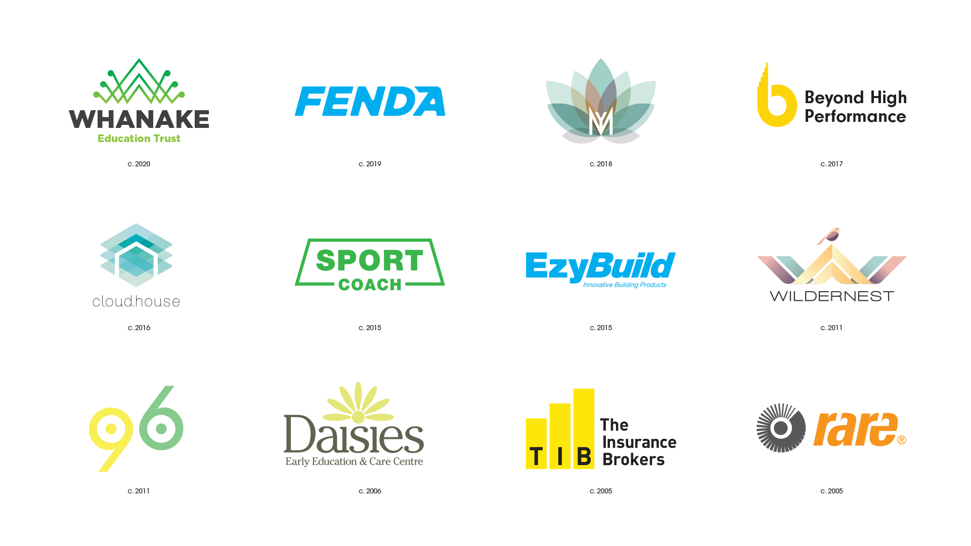
Brands designed for a variety of clients across many years. Brands are one thing that can stand the test of time. Proud to look back at some of these designs and still working with some clients today.

Kelly Brown
CEO
@ Triquestra, creators of the Infinity Retail Management System > infinityrms.com
“Since 2008, we’ve trusted Mata with Triquestra’s visual identity and design. Our brand and offerings have evolved during this time and we believe Mata’s understanding of our voice, combined with beautiful and innovative design has created a clear market position for our company, increasing engagement with our content, product and services.”
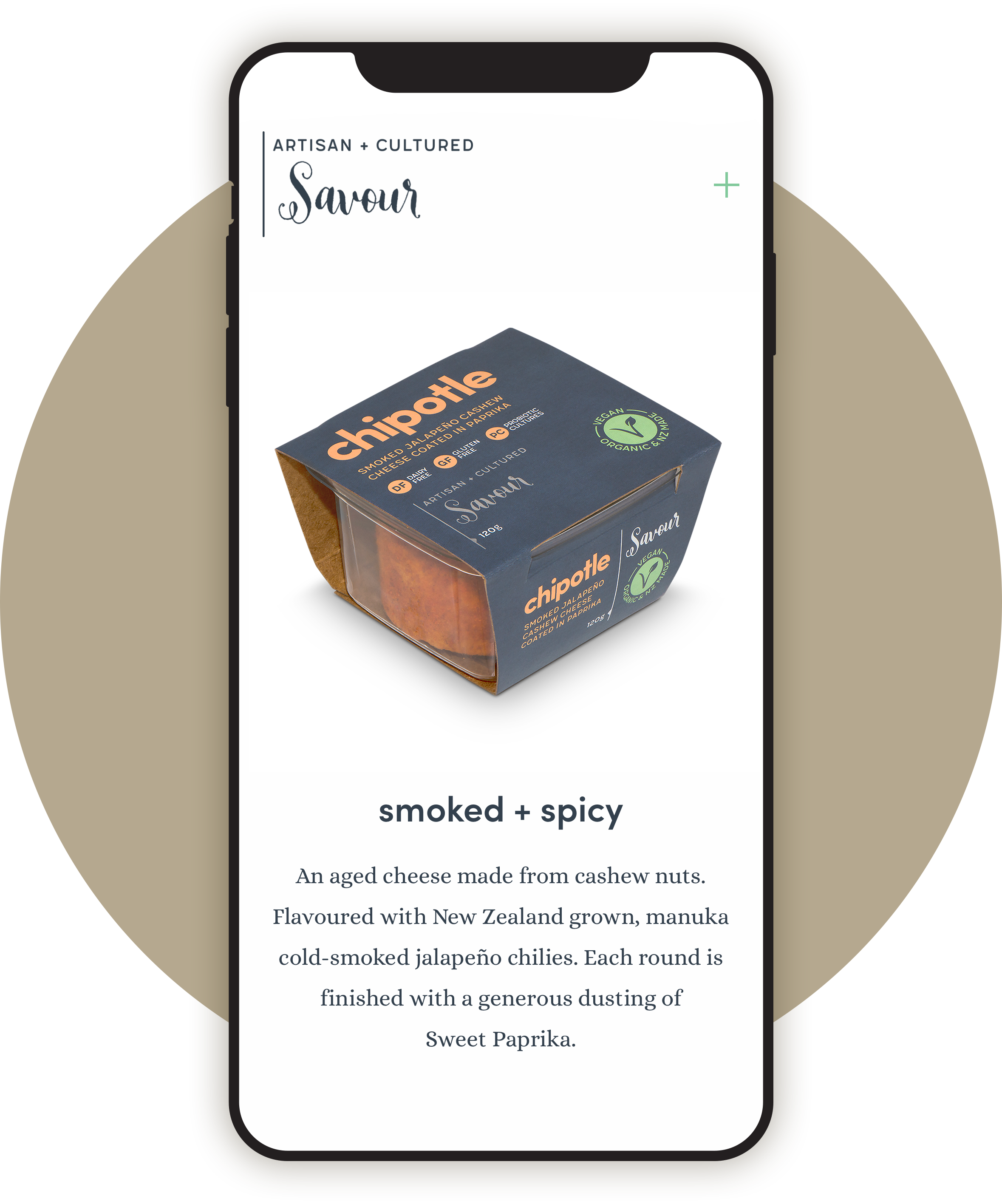
RESPONSIVE DESIGN
In one image, responsive website, brand reinvention, packaging design, photography and illustration for Savour is a good way to show the range of design, build and promotion that can be done by Mata. Customer experience all the way from the shelf to the website.
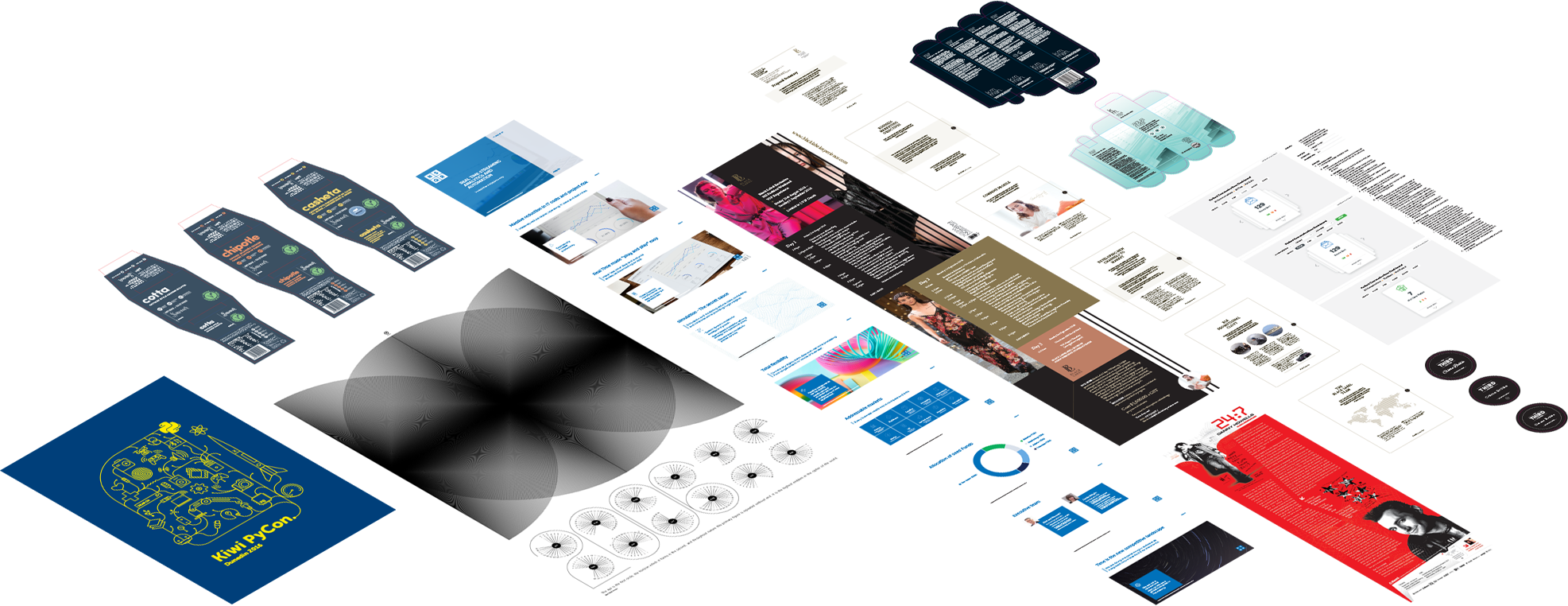
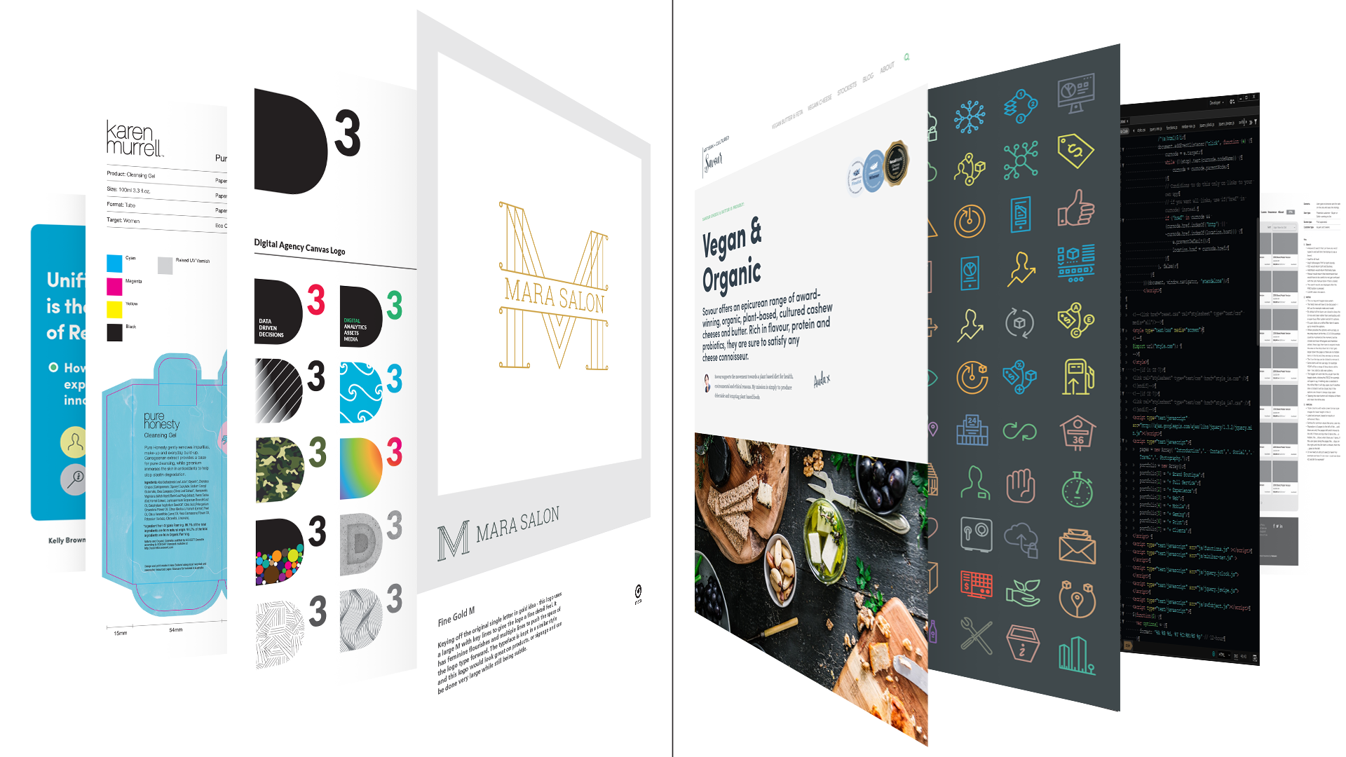
FULL STACK DESIGN
Design of everything from event tees to apps all tied to brands, combine websites, UI/UX, apps, prototypes, wireframes, posters, flyers, digital presentations & proposals and innovative packaging - yes it all happens here. Full stack design solutions from concept to delivery.


The art of Wiesław Wałkuski has always inspired me :)
Thoughts: It’s quiet for me. I am not used to this. So time to open up and self promote. I am open for full-time flexible roles or any new projects, in the meantime I am working hard to blog and share projects in detail, I hope you enjoy seeing the range of older and new work in the montages, contact me if you want to talk, best, M@